Krumbr is an aggregator platform created to synchronize all your personal bookmarks with the most popular internet browsers and devices. challenging big competitors such as Pocket, Diigo and Vookmark.
As UX/UI Designer in the team, I led the product team creating a consistent style between colours and fonts, building components and responsive screens. I worked alongside a junior UX Architect who focused on the Android app.
The Challenge
Since we had neither user testing nor user interaction analytics, I researched all the possible information about the most significant competitors on the market.
To test usability and functionalities of the other companies products, I’ve gathered an analysis group who could compile a document with the pros and cons of each product.
The Approach
Although the first brief was about developing better functionalities than competitors, we pushed for a different approach.
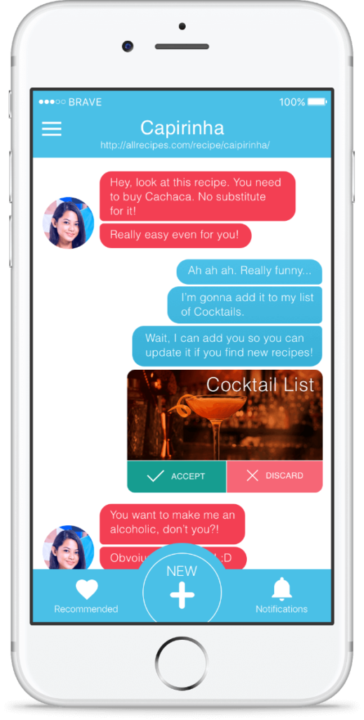
To differentiate Krumbr in a competitive market, we came up with a collaborative way to store and use bookmarks. Keeping in mind the experience with Facebook, we integrated a social process to work with shared links.
What if bookmarks could be used by teams of people involved in a single project? What if relevant links could be shared, commented and stored, exactly as it happens with Facebook posts?
We kept adding new persona profiles throughout the project to guide design decisions, priorities, and collaboration between the team and the stakeholder.
Our persona hypothesis consisted of six different archetypes which we used to facilitate discussions about our users’ needs, desires and varying contexts of use. Through careful analysis of our research, we identified sufficient behavioural variables to segment our user audience.
These variables could be categorised into activities such as frequency of use of the scheme, skills such as tech confidence and motivation to learn a new tool. We discussed the personas to develop a clear picture of whom the design of the app would target in phase 1 and later in future releases.
THE STRATEGY
A COLLABORATIVE CULTURE WITH LEAN UX
We opted for a lean approach which emphasised rapid sketching, prototyping, user feedback and design mockups.
BUILDING TRUST THROUGH TRANSPARENCY
Sharing our methods and thinking from the outset helped to build a stable client relationship.
GAINING REAL DATA FROM THE PROTOTYPE
We tested our prototype virtually and in-house with two different type of users: people who were using a competitors’ app and who never used a bookmark tool before.
STARTING ON THE SAME PAGE
Meeting with key stakeholders helped us to understand their business challenges. Together we identified risks, aligned with expectations and constructed a shared vision for the app.
WIREFRAME AND PROTOTYPE
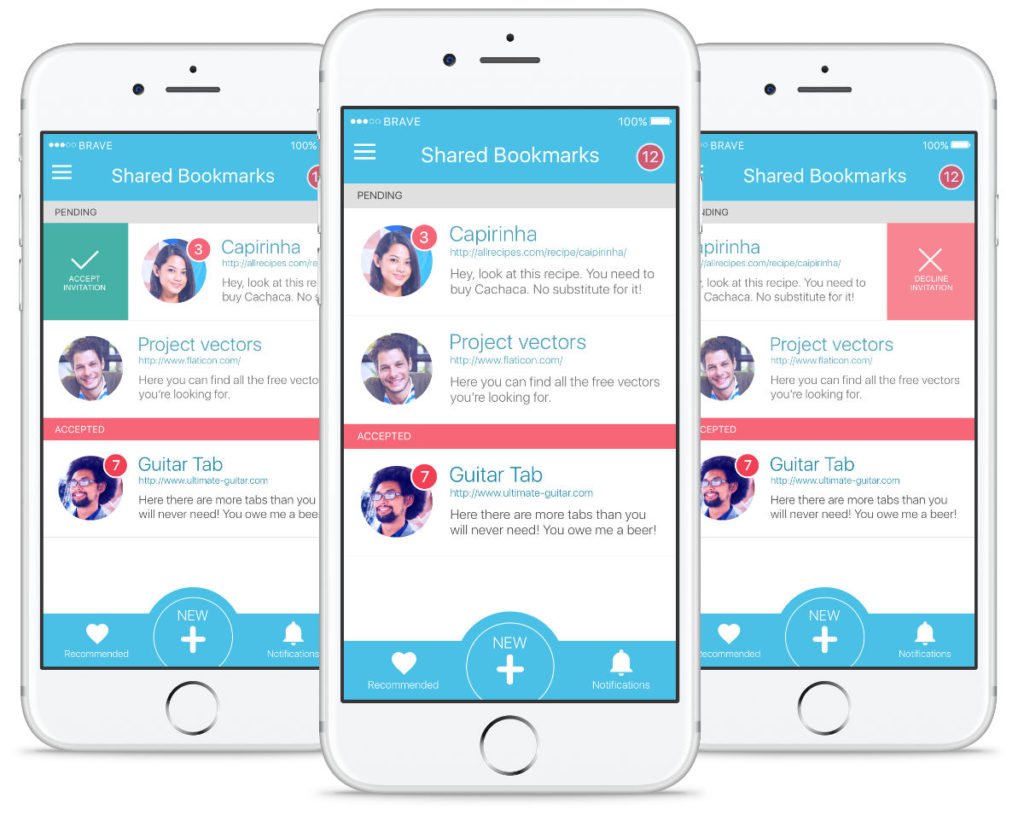
While our competitors save and store web pages in a private environment, we focused on helping users to share the experience and create a collaboration ecosystem. The wireframes first and the prototype then conveyed this vision to the stakeholders.
Invision proved to be the best tool of choice for prototyping. Because of tight timelines, I chose to develop a low‐fidelity prototype which had both benefits and drawbacks.
MILESTONE ROADMAP
The milestone roadmap was developed after the testing phase, and it was integrated in an Agile environment. We included opportunities for input at all stages to build trust and share ideas—forming a partnership which would have served much value beyond this phase.
HIGH-DEFINITION DESIGN
I’ve developed the high-definition design using a combination of Sketch and Photoshop, and I shared the project with my team on Invision. This method allowed everyone to add feedback and comments, as it would happen in a live brainstorming.
The main screen has been designed to allow quick access to primary functions of the application. The size of the thumbnails makes tapping easier, the order of the icons are based on ease of reach and the layout was chosen to provide a way for the design to scale for future releases.
If you need a UX Designer or you want to become one, then we need to talk
To get in touch with me, choose one of the option below! it won’t cost you anything to have a chat.