Funnel Countdown is a web app developed for entrepreneurs and companies who want to increase their sales using psychological triggers like urgency and scarcity.
The tool creates animated countdowns for web pages and emails, which stay synced on devices and browsers.
The Challenge
Funnel Countdown is an antithetical product than all the timer tools on the market with a confused UX and a high price. The lack of attention to the client from the competitors pushed me to create something that could finally be easy to use at an affordable cost.
The primary characteristics of the Funnel Countdown core are a simple interface and a low learning curve. We took a profound overview of the leading competitors, and we sectioned each tool to highlight strengths and weak points.
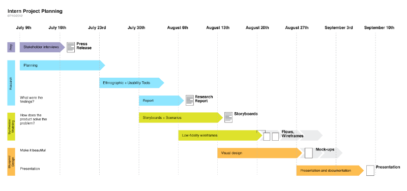
We decided to set a specific date for the product launch, and we grew a list of marketers who wanted to try the tool first hand. That gave us a short time to build a beta and accountability to our future users.
Creating a schedule was an essential step to assign specific deadlines to each team component.
The Approach
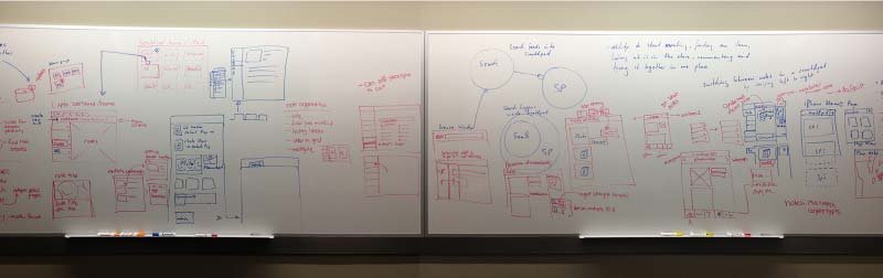
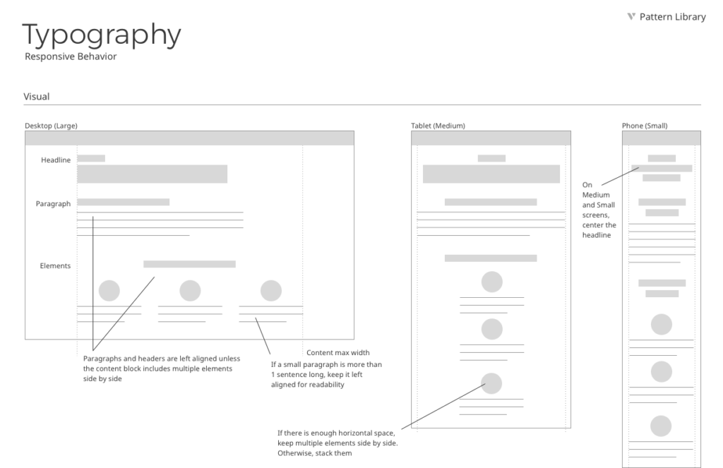
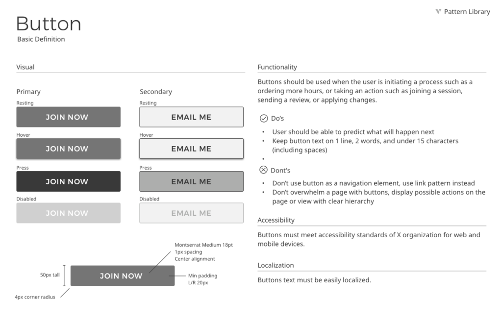
Since the project started from scratch, I had no analytics to guide my plan. I started working on a guideline that included colours, fonts, graphical elements and functionality behaviours.
All of the pattern documentation has been collected in a master Sketch file, and non-UI patterns, such as copywriting guides and icon libraries, were stored and shared using Google Drive.
BETA TESTING
The Beta version included essential features, responsive design to adapt to mobile devices, and a platform to store feedback and questions. For the first round of testing, we invited 20 high-level online marketers and the possibility to integrate 2 CRMs.
For the first round of testing, I prepared a list of requirements that users needed to accomplish, and then they’ve been provided with a survey to state feedback about the experience.
Consistency through the Beta version was defined by colours, typography, images and icon styles.
Below a set of icons I created to keep the tool consistent.
RESULTS AND ANALYTICS
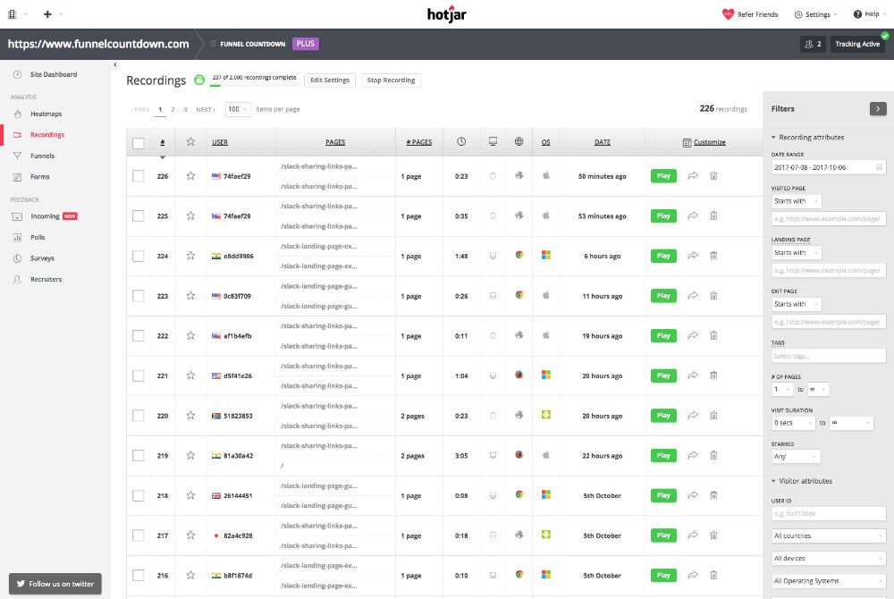
I used Hotjar to track the users’ behaviours and identify usability issues. Each session has been recorded as testers were clicking, tapping, moving the cursor, typing and navigating across pages.
At the same time, I used heatmaps to understand how users were interacting with the tool, which areas were clicked or tapped the most.
If you need a UX Designer or you want to become one, then we need to talk
To get in touch with me, choose one of the option below! it won’t cost you anything to have a chat.