The Citysense project born from the request of the Chicago Police Department, to take their outdated desktop software to monitor crime rates around the city and move it to a portable device.
As UX Senior Designer collaborating with enforcement teams based in Chicago, I worked on bringing all the data from a vast and disordered system into the small screen of a tablet.
The Challenge
The software we’ve been asked to work on was an old disordered system to monitor and collect all the data regarding crimes around the city. It runs on a 3-screen desktop, and an operator on site had to update the information in it based on what police officers on the ground reported by phone.
We needed a quicker way to keep officers and central system up-to-date, and our solution was to deliver a more accessible version of the primary system running on a tablet for each street-patrol.
The Approach
I classified all the most used actions in the software and discarded the other ones from the tablet version. In this way, the portable version would have been easier and quicker to use.
Then I listed all the possible user flows of the desktop version, and I divided them into primary and secondary actions. The former group was the only one to include in the tablet version.
“User flows are the best way to create a storyboard of the app, highlighting the feature to keep and the one to discard.”
I’ve organised brainstormings and skype calls with the stakeholders to arrange a set of primary features for the field patrols, and then I interviewed users for advice and requests.
With the new system in place, the desktop software would receive instant feedback, and the in-house operator would become a hub for coordinating and assigning crime cases to specific teams.
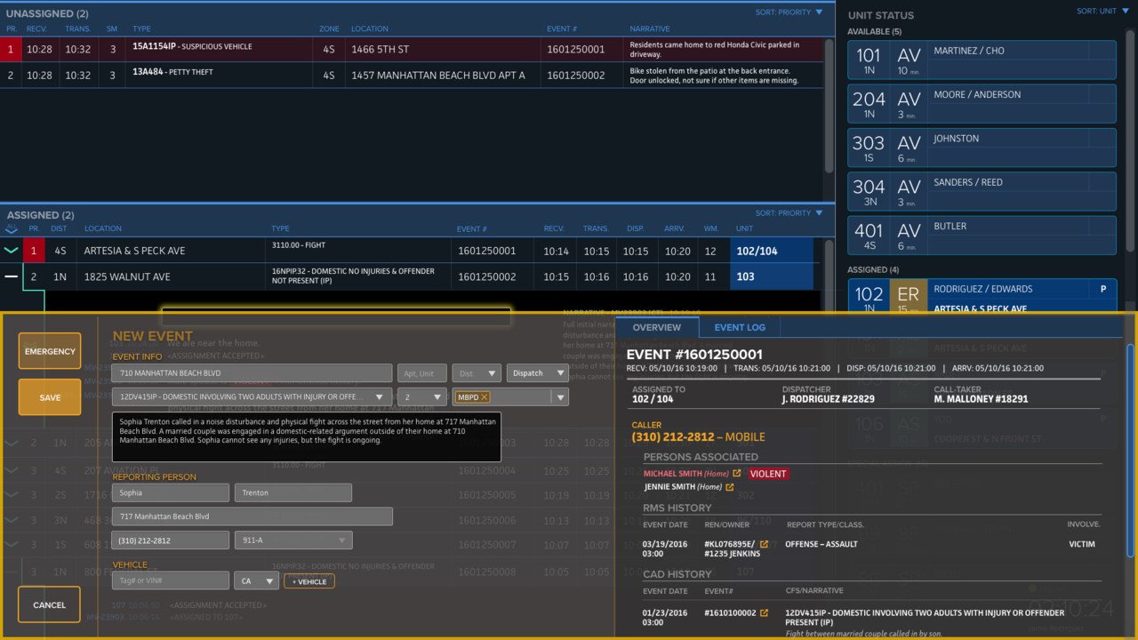
WIREFRAME AND PROTOTYPE
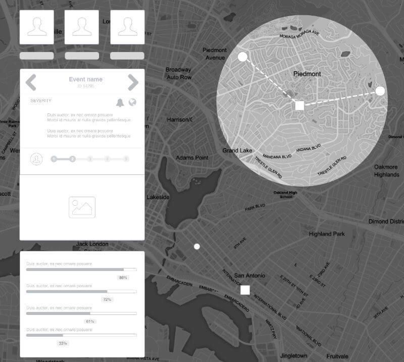
With the function structure built, I started working on the wireframes. Instead of using a table to display all the data, I decide to opt for a city map, placing all the events in the respective place, as it would happen with a traffic app. Tablets give the possibility to use gestures like swiping, zooming, pinching and rotating. Surfing through data using a map is in this way more user-friendly than scrolling along a table of data.
HI-DEF DESIGN
The style guide is the essential asset to maintain control of the design and make it more cohesive. I used Sketch to list all the best practises about colours, patterns, fonts, spaces, grid and tone of voice.
Icon and asset libraries were shared with the entire team using Google Drive and Dropbox.
If you need a UX Designer or you want to become one, then we need to talk
To get in touch with me, choose one of the option below! it won’t cost you anything to have a chat.